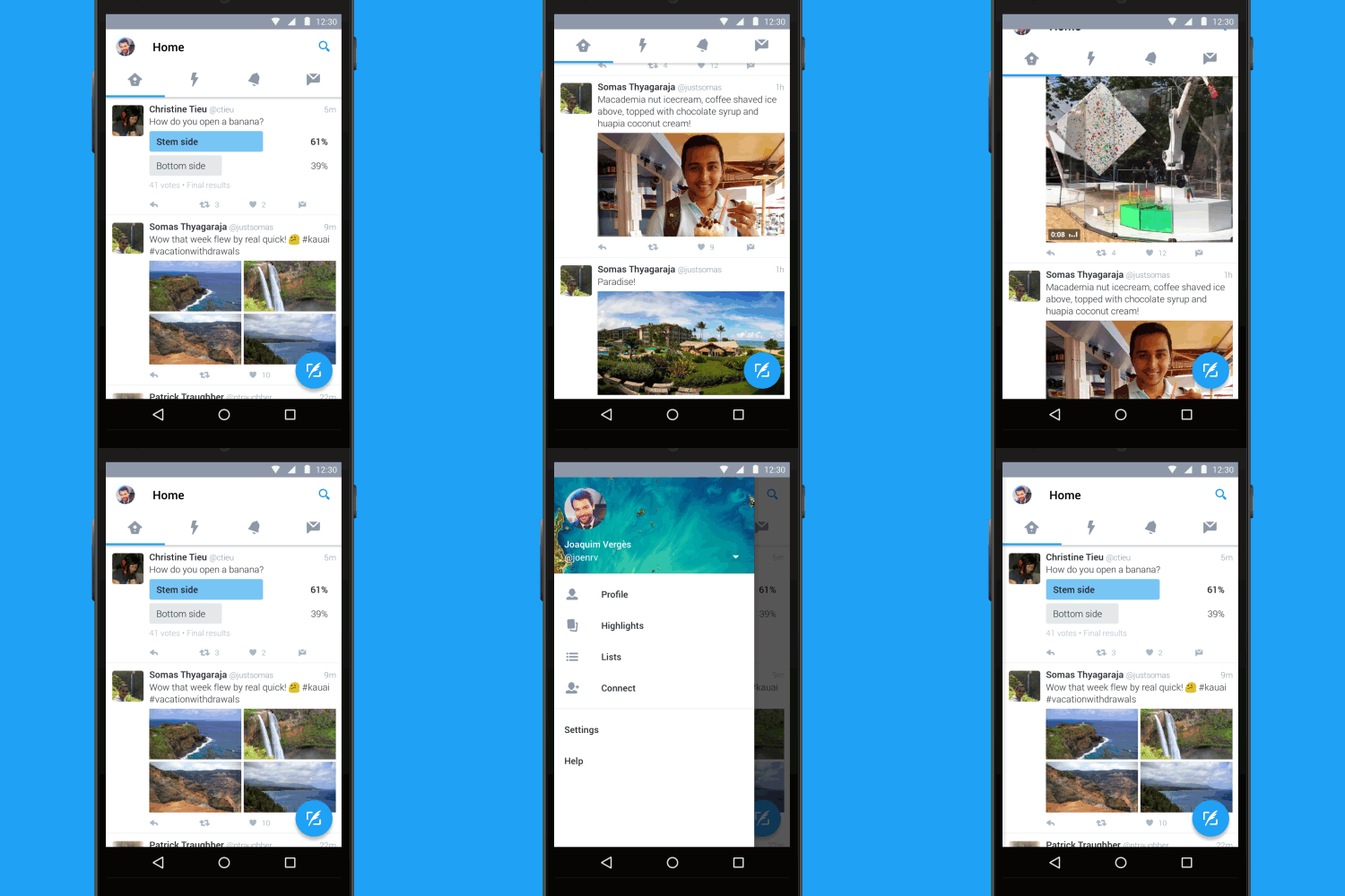
The official Twitter app for Android is getting a major makeover today that brings a full-on Material Design makeover along with improvements in the overall user interface of the app. The update is rolling out now in the Play Store so if you have it installed, you should be seeing the OTA update over the course of the next day or so. Once you have it, you will have a vastly improved Twitter experience on your phone or your tablet.
From the announcement on the Twitter blog, here are the key highlights of this release:
- Tab bar at the top of the screen with swipe functionality so you can quickly move between your Home timeline, Notifications, Direct Messages, and more.
- Navigation menu that slides out from the side for access to your profile, Highlights, lists, the Connect tab, and settings.
- New floating action button so you can always easily send a Tweet.
As you can see from the animation to the right, the overall flow and feel of this update to Twitter is pretty impressive and it should significantly improve navigation around the app. Frankly, it fits more in line with what other apps and Google themselves have been doing with their own apps.
So what do you think? Leave a comment here! 


No comments:
Post a Comment