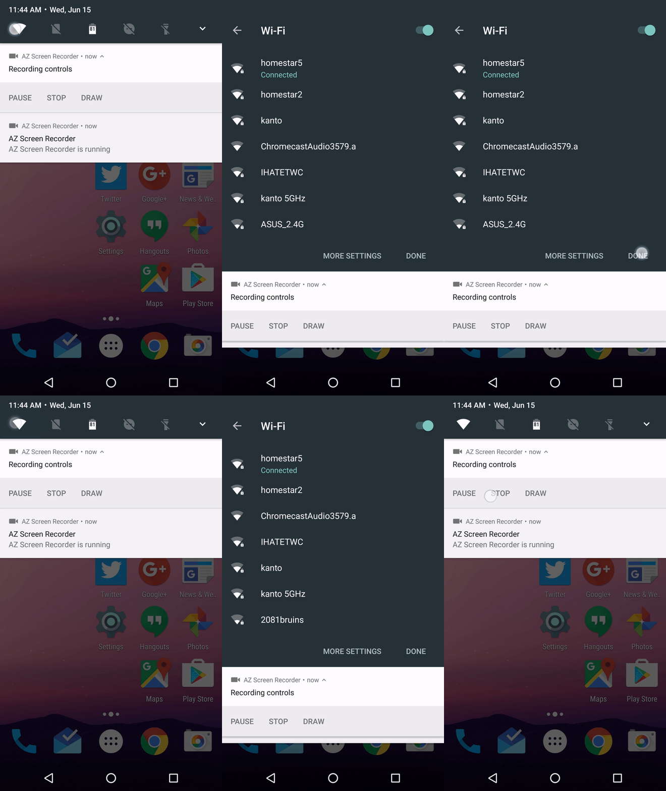
Android N is making some changes to the notification shade, not least among them the addition of settings toggles at the top of the screen without opening quick settings. In previous preview builds these were toggles as you'd expect, but DP4 changes it up. Now, the WiFi and Bluetooth buttons open the full modal connection list screen. The response from users has not been positive.
In Android N, you can always see the first five quick settings icons at the top of your notification shade. In previous builds, tapping the WiFi and Bluetooth icons would turn them on and off, however that wasn't (and still isn't) the default behavior in the full shade. In quick settings, tapping those icons opens the connection list with a toggle to turn the radio on and off. In DP4, the notification toggle does the same thing. You can make the argument that it makes sense this way, but it looks a bit awkward and adds an extra tap to toggle the setting.
A ticket for this has been added to the Android N issue tracker where it has already accumulated more than 1,000 stars. Everyone is adamant that this behavior is counter-intuitive. A Googler has replied and said the defect has been relayed to the development team. More information will be available later, but there's always the chance the dev team will stubbornly stick with this version.

No comments:
Post a Comment